
There’s a chart I keep coming back to…
Not the price of the Dow…
Not new highs of the S&P 500 and Nasdaq…
This one:
And once you understand what it’s telling you, you won’t be able to ignore it either.
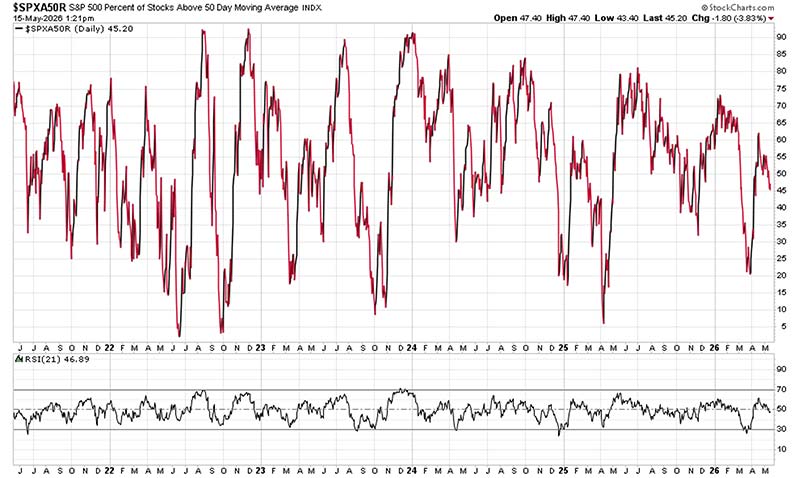
It’s called the $SPXA50R. It shows the percentage of S&P 500 stocks trading above their 50-day moving average.
Right now, that number sits at about 45%.
Let that sink in for a second.
The S&P 500 is near all-time highs. And yet fewer than half of its own stocks are trading above their 50-day moving average.
And while all the talking heads on CNBC are raving about record highs, I’m here to tell you the truth.
It’s not strength, it’s an illusion.
The 50-Day Is the Trend
I’ve been doing this for nearly 30 years, and the one thing that never goes out of style is the trend.
The 50-day moving average is the single cleanest way to measure it. When a stock is above its 50-day, it’s in a trend. When it’s below, it isn’t. Simple as that.
So, when I look at this chart and I see that only 45% of S&P 500 companies are above their 50-day MA, while the index itself is sitting at all-time highs, I proceed with extreme caution.
Because what that tells me is that a very small group of stocks is doing all the heavy lifting.
The rest of the index is barely treading water beneath the surface.
We’ve seen this movie before… it was called 2021 and early 2022.
The Magnificent 7 were carrying the entire index on their backs while the broader market was rolling over.
This chart looked nearly identical then. And you know what happened next…
It took less than a year for the S&P to drop 27% from its January 2022 peak. It was one of the worst years for stocks in decades.
The broader market got absolutely crushed, with many retail names falling 50, 60, 70% or more.
The point is: Despite “all-time highs”, this market is far from healthy.
What a Healthy Market Actually Looks Like
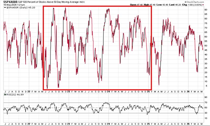
Let’s look again at the five-year chart of the $SPXA50R. Pay attention to the middle stretch, the summer of 2022 through most of 2024.
That’s what you want to see.
Big, wide swings. Peaks and troughs of the indicator ripping from 5 or 10% all the way up to 90 or 95%, then pulling back, then doing it again.
That’s the rising tide lifting all ships.
When this indicator is swinging like that, it means capital is rotating broadly across the market. Sector after sector is participating.
That’s when traders make real money… both on the long and short side.
Because those deep valleys were some of the best buying opportunities of the last several years. And those peaks near 95% is when you tighten up, take profits, and start looking for the exits.
The Warning Sign
Now look at where we are today…
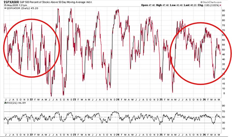
The indicator’s compressing, stuck in a tight range.
Just like the pattern we saw in early 2022, when this chart spent months unable to get above 40 or 45% before the market finally had its washout.
A tight chart like this means the market is being propped up by a handful of companies. The rest of the S&P is dead weight. And that’s a dangerous place to be, because there’s no clean way to play it.
You can’t trust the index. You can’t trust the breadth. You’re essentially trading on a handful of mega-cap names and hoping they don’t stumble.
That’s how traders lose 20 to 30% in a matter of months…
Not because they weren’t watching the S&P, but because they were watching only the S&P.
What to Do
Here’s how I’d approach it right now. Pull up a list of the S&P 500 companies that are above their 50-day moving average.
Those are the stocks doing the work. Those are your leaders.
Spoiler: it’s the usual suspects… Nvidia (NVDA), Apple (AAPL), Amazon (AMZN), Alphabet (GOOGL). These are the biggest stocks in the S&P, and they’re all well above their 50-day MA.
Then pull the reverse. Look up the biggest market cap names that are below their 50-day.
Home Depot (HD), Pepsi (PEP), Hershey (HSY), Target (TGT), etc… These are smaller names, sure. But there are much more of them below their 50-day MA.
These economically sensitive sectors reflect what’s really happening in the broader economy.
On the surface, the market’s headline number looks fine. But underneath it, the real economy is struggling to keep up.
And with shoulder season working against us (July, August, and September are historically the weakest months of the year) this compressed breadth could easily get amplified to the downside.
Keep an eye on this chart. It’s not flashy, and it doesn’t give you a buy or sell signal on a single stock…
But it will tell you whether this market has the foundation to sustain a rally… or whether it’s about to crack.
Right now, it’s telling me to be careful.